
Select
Select is the ordinary single-select list component. It owns an internal ListState, registers a keyboard handler on the current input layer, and turns j/k, arrow keys, Home/End, and Enter into list navigation and selection callbacks.
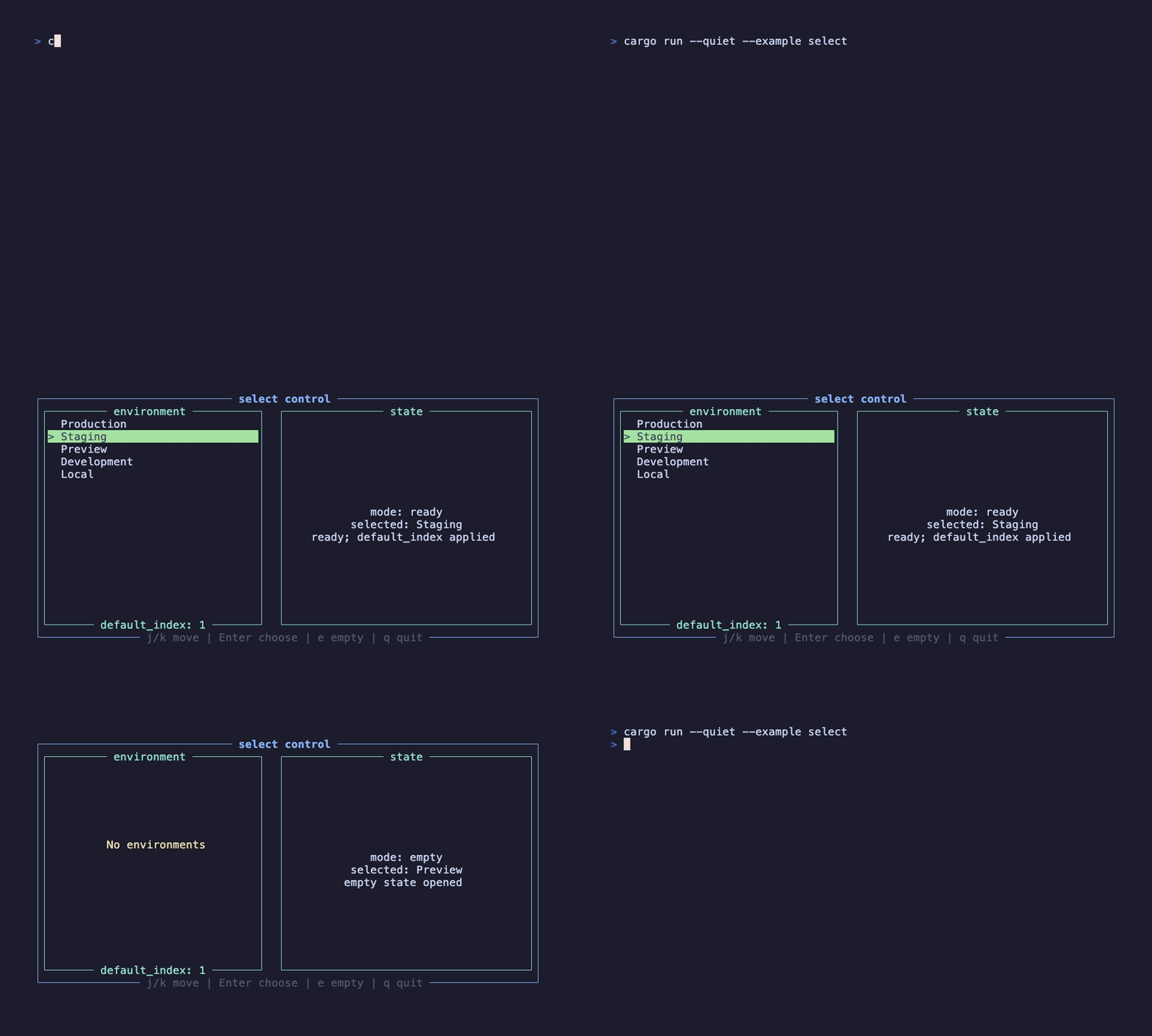
This recording is generated by docs/tapes/select.tape. The example waits for data to load, then default_index restores the cursor to Staging; it moves to Preview, presses Enter to trigger on_select, and then switches to the empty state.
Press j/k to move, Enter to select, e to toggle the empty state, and q to quit.
Minimal form
Section titled “Minimal form”default_index is an index, not a value. It only sets the default cursor: if the list starts empty and data arrives later, the component selects that index after data appears. If the user has already moved the cursor, list length changes do not force their position back to the default.
Empty state and input
Section titled “Empty state and input”When the list is empty, Select renders only empty_message and does not consume navigation or confirm keys. The parent component can still handle other shortcuts, such as e and q in the example.
Select uses an EventScope::Current handler. When rendered inside a Modal subtree, the handler automatically belongs to the modal layer; on an ordinary page, it belongs to the current page layer. If multiple selectors exist at once, set active: false on the one that should not currently respond to input.
Layout and style
Section titled “Layout and style”Select can receive width, height, margin, and offset directly, without wrapping it in an extra layout container.
If business code needs full cursor control, pass external state: State<ListState>; otherwise the component uses its own internal state. For ordinary multi-select, see MultiSelect. For long lists and custom row rendering, see VirtualList.