
ConfirmModal
ConfirmModal is the ordinary confirmation dialog component. It creates an exclusive input layer internally and passes that same layer to the low-level Modal, so while the dialog is open, background lists, page shortcuts, and other lower handlers do not handle the same keys.
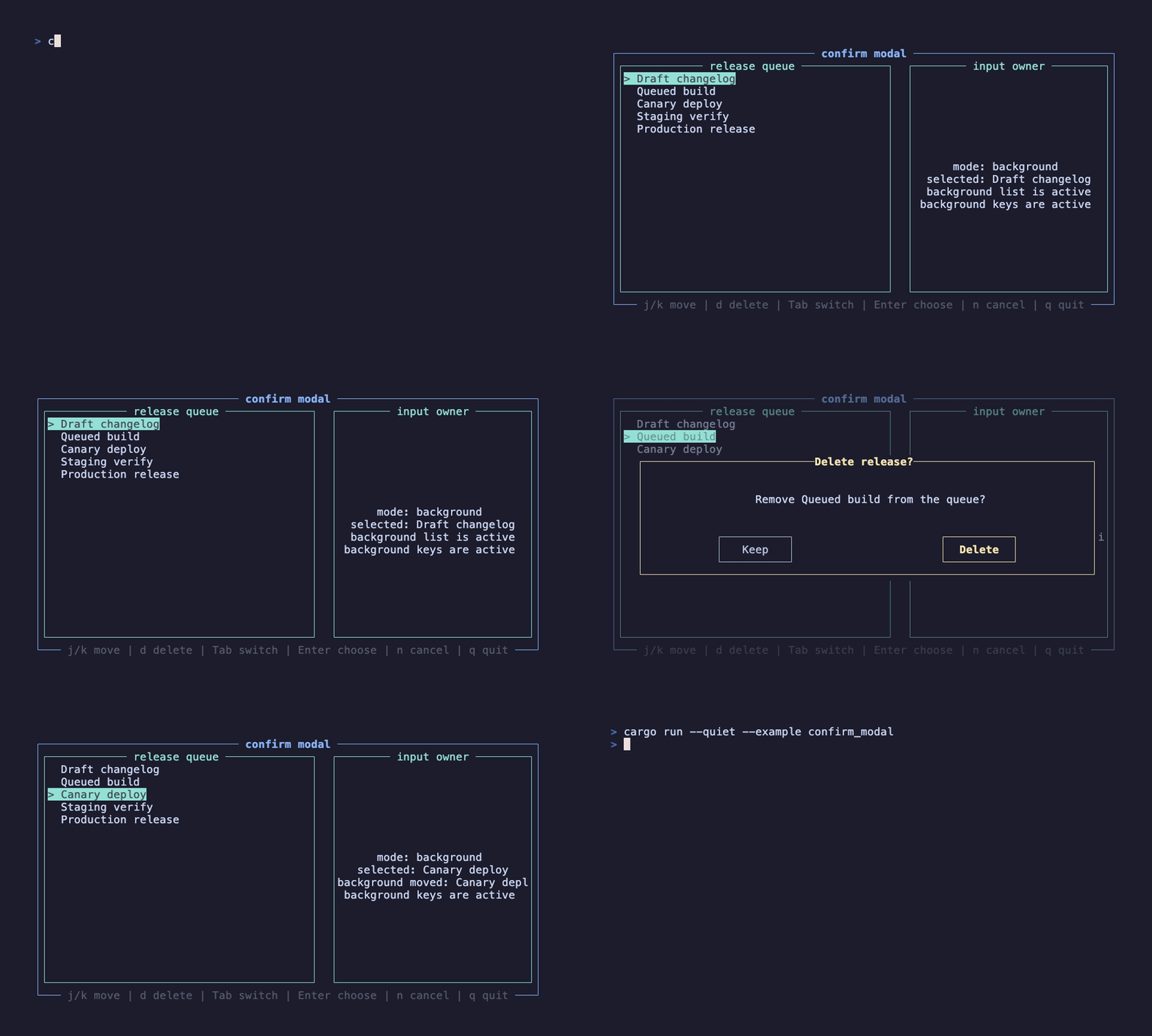
This recording is generated by docs/tapes/confirm-modal.tape. The example first moves the background list to Queued build, then opens a delete confirmation. While the dialog is open, pressing j once does not move the background selection further. It then uses Tab to focus Delete, presses Enter, and demonstrates canceling with n.
In the background state, press j/k to move and d to open the dialog. Inside the dialog, press Tab, arrow keys, or BackTab to switch buttons, Enter to trigger the focused button, y to confirm directly, and n or Esc to cancel.
Minimal form
Section titled “Minimal form”ConfirmModal is controlled: open decides whether it is shown, and the component does not mutate external state by itself. on_confirm and on_cancel express only user intent; business code decides whether to close the dialog in the callback. That lets you run synchronous validation, async submit, or secondary state updates before closing.
Input exclusivity
Section titled “Input exclusivity”Internally, the component is equivalent to this pair:
This is the pattern recommended in Input Layers. Ordinary confirmation dialogs do not need business code to write use_input_layer; pass open, text, and callbacks to ConfirmModal, and it guarantees that the foreground dialog owns the keyboard.
Unknown keys are consumed by the dialog layer too. In the example, pressing j while the dialog is open does not move the background queue because the ConfirmModal layer has blocks_lower=true.
Button state
Section titled “Button state”Focus defaults to the cancel button, which is the safer default for confirmation dialogs. Users can change or trigger buttons with:
| Key | Behavior |
|---|---|
Tab / BackTab | Switch between cancel and confirm |
Left / Right | Switch between cancel and confirm |
Enter | Trigger the focused button |
y / Y | Confirm directly |
n / N / Esc | Cancel directly |
button_style styles unfocused buttons. selected_button_style styles the focused button: border and text highlight together, but the whole button body is not filled as a color block. If the style includes a background color, the component converts that background into the focus accent color:
Size and style
Section titled “Size and style”ConfirmModal exposes the low-level Modal width, height, and mask style, plus content-area styles:
If the dialog needs lists, input boxes, scroll regions, or complex shortcuts, use the low-level Modal + use_input_layer composition instead. For informational dialogs, see AlertModal; for shortcut help, see ShortcutInfoModal.