
Declarative syntax
A JSX-style proc-macro. if / for / match are first-class inside child blocks, { expr } embeds any Rust expression, and widget() bridges native ratatui widgets.
Components, hooks, input layers, routing and global state — built on Ratatui and Tokio. You describe the UI; the runtime owns the loop.
ready
Delete task?
process exited · terminal restored
press enter to restart todo_app
On the left, plain Ratatui: you own the terminal, the loop, the timer and the exit. On the right, ratatui-kit: state and UI — everything else is the runtime's job.
plain ratatui · 21 loc ratatui-kit · 17 loc
fn main() -> std::io::Result<()> {
    let mut terminal = ratatui::init();
    let mut count = 0_u64;
    let mut last = Instant::now();
    loop {
        terminal.draw(|f| ui(f, count))?;
        if last.elapsed() >= Duration::from_secs(1) {
            count += 1;
            last = Instant::now();
        }
        if event::poll(Duration::from_millis(50))? {
            if let Event::Key(k) = event::read()? {
                if k.code == KeyCode::Char('q') {
                    break;
                }
            }
        }
    }
    ratatui::restore();
    Ok(())
}#[component]
fn Counter(mut hooks: Hooks) -> impl Into<AnyElement<'static>> {
let mut count = hooks.use_state(|| 0_u64);
hooks.use_future(async move {
loop {
tokio::time::sleep(Duration::from_secs(1)).await;
count += 1;
}
});
element!(
Border(border_style: Style::new().yellow()) {
Text(text: Line::from(format!("Counter: {:02}", count.get())))
}
)
}No features are enabled by default — turn on router, atom, input, tree as you need them.
use_state holds state, use_future runs async, element! declares the tree. Instances persist across frames.
The terminal goes fullscreen, the counter ticks every second, q quits — and the terminal is restored.
ratatui-kit doesn't replace Ratatui — it adds the component, state and event layers a growing terminal app needs.
A JSX-style proc-macro. if / for / match are first-class inside child blocks, { expr } embeds any Rust expression, and widget() bridges native ratatui widgets.
use_state, use_future, use_effect and custom hooks, organized by call order. State handles are Copy, support count += 1, and release when the component unmounts.
Events route to the active layer instead of broadcasting to every component. Open a modal or an edit mode, and the background yields the keyboard.
State writes wake the render loop, so the framework repaints on real change — never on a timer, never by hand.
One shared Palette is the color source every component derives from. Swap it to re-theme the whole tree, or drive it from an Atom at runtime.
A router with a history stack manages pages; atoms manage business state shared across them.
When a modal opens or editing starts, the framework hands the keyboard to that layer — background components stop seeing keys entirely.
read the input-layer reference →key events ─▶ layer 2 · modal — background receives nothing
// Request an input layer when entering edit mode
let edit_layer = hooks.use_input_layer(editing.get(), true);

// The handler only receives key events while this layer is active
hooks.use_event_handler(
    EventScope::Layer(edit_layer),
    EventPriority::High,
    move |event| {
        let Event::Key(key) = event else {
            return EventResult::Ignored;
        };
        match key.code {
            KeyCode::Enter => editing.set(false),
            KeyCode::Char(c) => draft.write().push(c),
            _ => {}
        }
        // The background list never sees these keys
        EventResult::Consumed
    },
);One assignment and every dependent re-renders — no redraw calls, no timers. This button is the whole idea:
Counter
├─ Border ───────── count: 07
└─ Text ─────────── count: 07 14 business-neutral components — layout, input, overlays, selection, virtual lists — each with a runnable example and a real recording. Click through the list, or focus it and press j / k.
Flex containers, bordered grouping and paragraph rendering — the primitives that slice a component tree into terminal regions.
view docs →View(flex_direction: Direction::Vertical, gap: 1) {
Text(text: "header")
View(height: Constraint::Fill(1)) {
Text(text: "body")
}
Text(text: "footer")
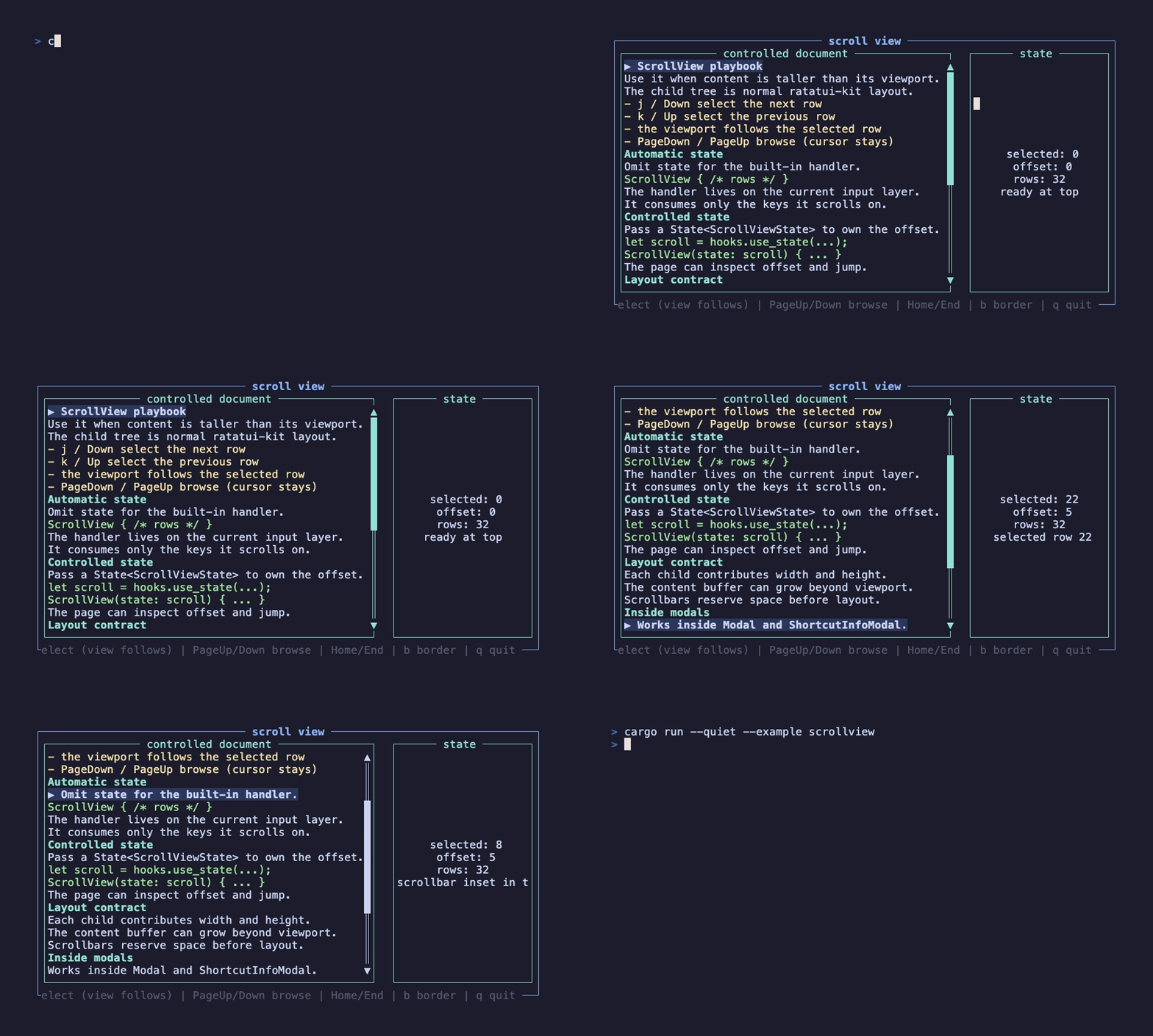
}Content beyond the viewport renders into a larger buffer first, then displays by offset — j/k, paging and a scrollbar included.
view docs →ScrollView(
flex_direction: Direction::Vertical,
block: Block::bordered(),
) {
for (i, row) in rows.iter().enumerate() {
View(key: i, height: Constraint::Length(1)) {
Text(text: row)
}
}
}
Hard-wraps long text at a given width, then writes the real line count back into layout height so ScrollView computes the scroll range correctly.
view docs →ScrollView(scroll_view_state: scroll_state, block: Block::bordered()) {
WrappedText(
text: BODY,
wrap_width: 72,
style: Style::new().white(),
)
}
Single-line input display over tui_input state; writing, submitting and exiting stay with the page handler.
view docs →Border(height: Constraint::Length(3)) {
Input(
input: input.read().clone(),
placeholder: "Type and press Enter".to_string(),
cursor_style: Style::new().bg(Color::Yellow),
)
}
Search box with an edit mode: press s to enter input and open an exclusive layer — activation, submission, validation and mutex wrapped.
view docs →SearchInput(
value: query.read().to_string(),
placeholder: "Press s to search".to_string(),
on_change: move |next: String| query.set(next),
on_submit: move |value: String| {
submitted.set(value);
true
},
)
Low-level overlay: draws the backdrop, positions content, and provides the current input layer to its subtree.
view docs →Modal(
open: open.get(),
width: Constraint::Length(68),
height: Constraint::Length(12),
) {
Border(top_title: Line::from("Details").centered()) {
Text(text: Line::from("Modal content"))
}
}
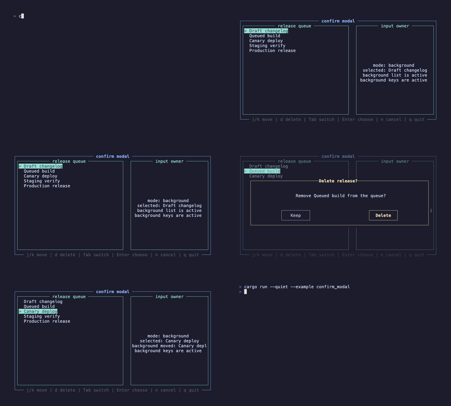
Confirmation dialog with an exclusive input layer: confirm/cancel, button focus and mutex, controlled by open.
view docs →ConfirmModal(
open: confirm_open.get(),
title: Line::from("Delete release?"),
content: format!("Remove {selected_label}?"),
confirm_text: "Delete".to_string(),
on_confirm: move |_: ()| confirm_open.set(false),
on_cancel: move |_: ()| confirm_open.set(false),
)
Notice dialog without buttons: shows a message, fires on_close, and intercepts lower-layer input meanwhile.
view docs →AlertModal(
open: alert_open.get(),
title: Line::from("Workspace is current"),
message: format!("{selected_label} is synced."),
on_close: move |_: ()| alert_open.set(false),
)
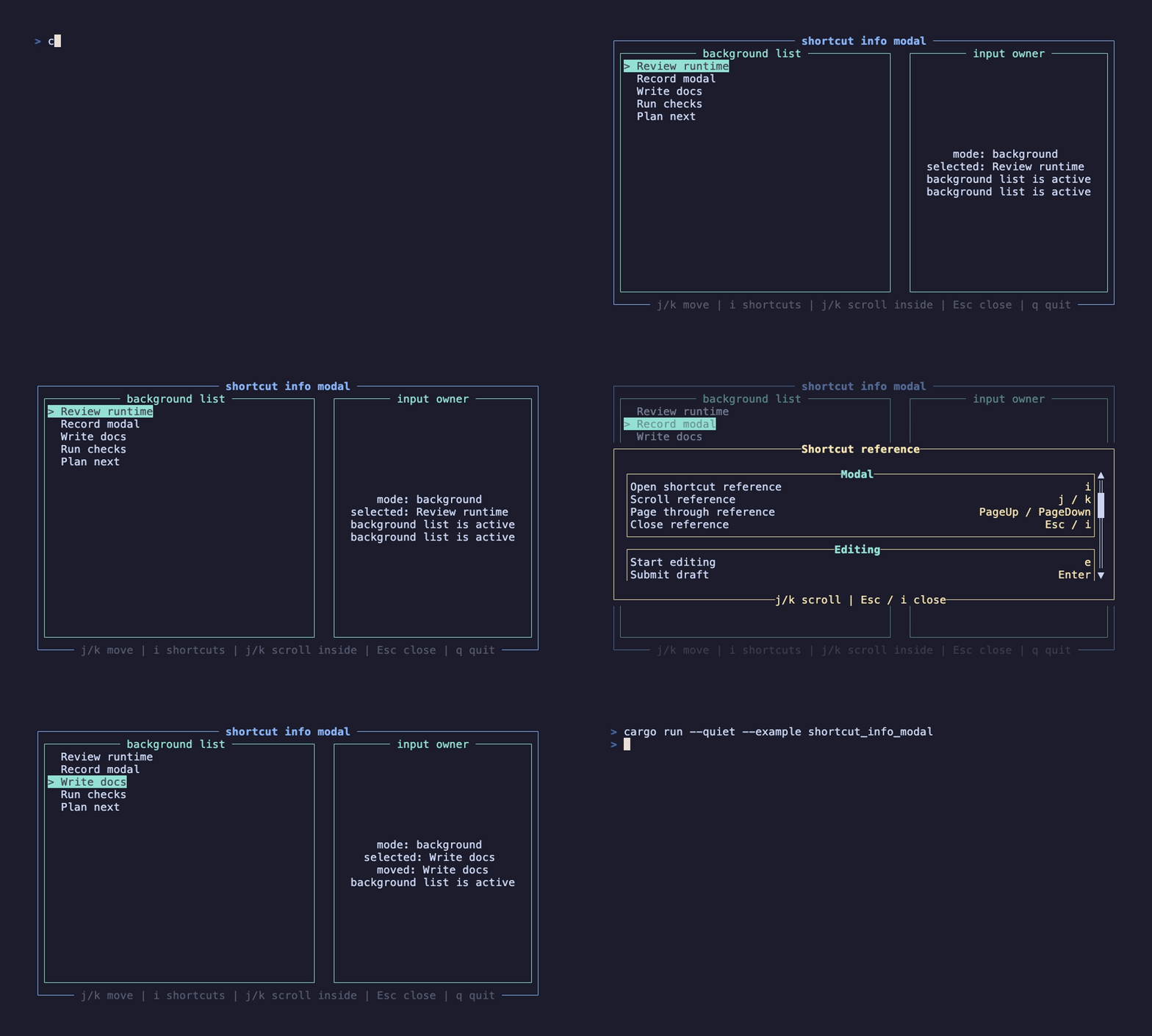
Shortcut help dialog grouped by section; overflowing content scrolls while the modal keeps the input mutex.
view docs →ShortcutInfoModal(
open: shortcuts_open.get(),
title: Line::from("Shortcut reference"),
sections: vec![ShortcutInfoSection::new(
"Navigation",
[("Down", "j"), ("Up", "k")],
)],
on_close: move |_: ()| shortcuts_open.set(false),
)
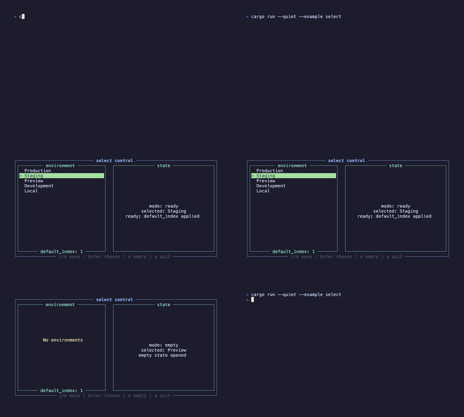
Single-select list with an internal ListState: j/k, arrows, Home/End and Enter become navigation and a select callback.
view docs →Select<&'static str>(
items: items,
default_index: Some(1),
highlight_symbol: "> ",
empty_message: "No environments",
on_select: move |item: &'static str| {
selected.set(item);
},
)
Two-level interaction: Space toggles the draft selection (on_change), Enter commits it (on_select).
view docs →MultiSelect<&'static str>(
items: items,
highlight_symbol: "> ",
on_change: move |items: Vec<&'static str>| {
selected_count.set(items.len());
},
on_select: move |items: Vec<&'static str>| {
submitted.set(items.len());
},
)
Hierarchical selection (tree feature) over tui-tree-widget: collapse/expand, path-style selection and input mutex.
view docs →TreeSelect<&'static str>(
active: true,
items: demo_items(),
default_selection: vec!["components", "select"],
node_open_symbol: "- ",
node_closed_symbol: "+ ",
on_select: move |id: &'static str| {
submitted.set(id);
},
)
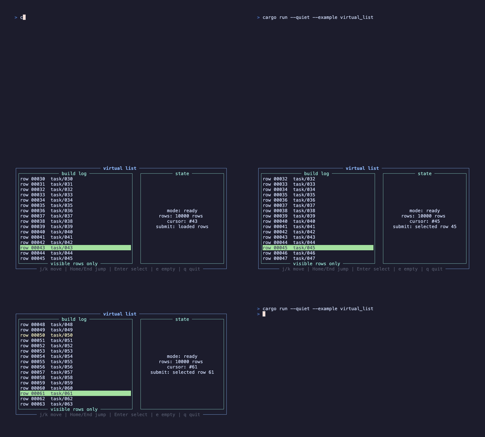
Long lists (virtual-list feature): only the visible window renders — tens of thousands of rows with custom row rendering.
view docs →VirtualList<Line<'static>>(
item_count: 10_000,
default_index: Some(42),
render_item: |ctx: &ListBuildContext| {
let style = if ctx.is_selected {
Style::new().black().on_green()
} else {
Style::new()
};
(Line::styled(format!("row {:05}", ctx.index + 1), style), 1u16)
},
)
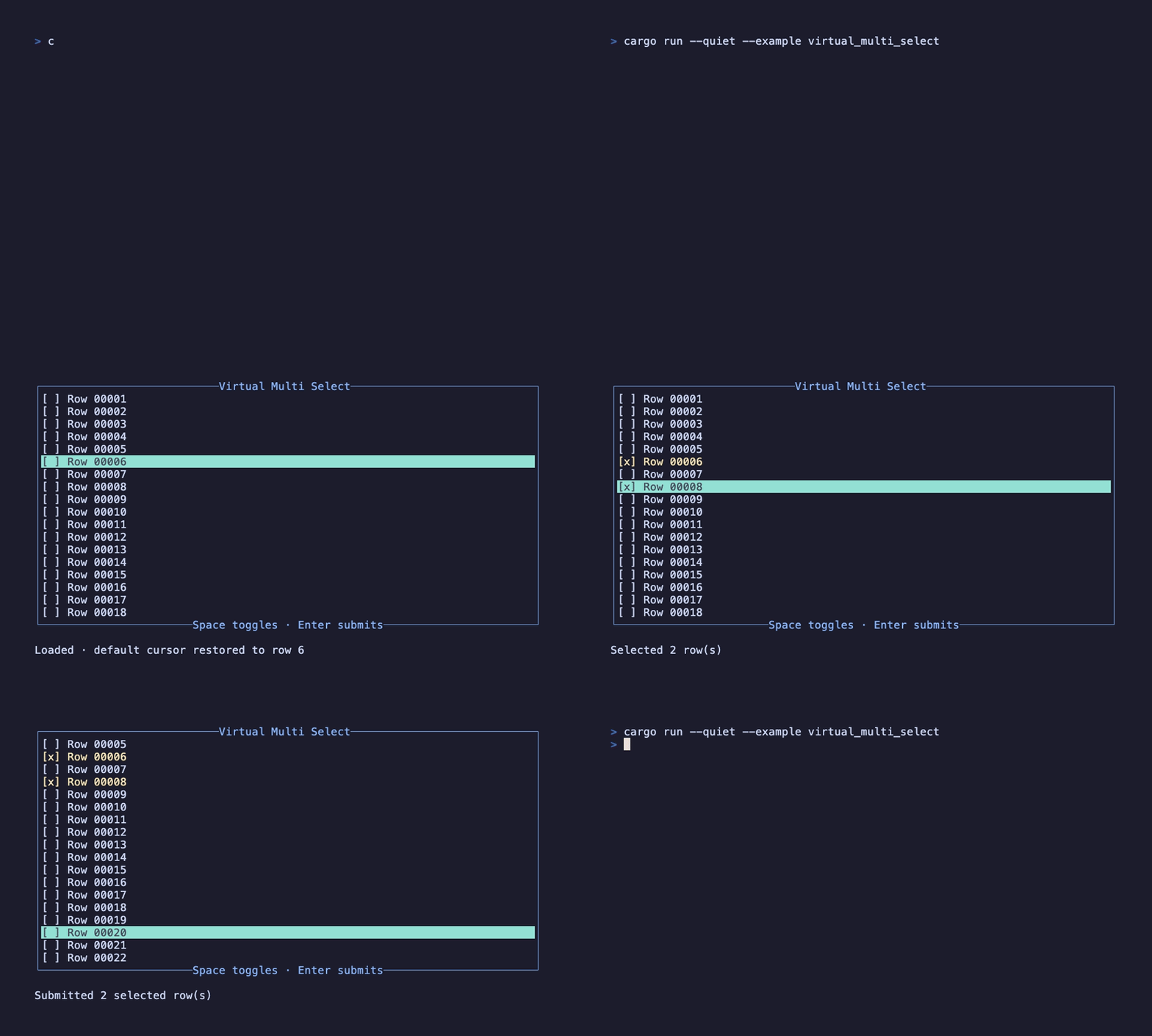
Composition for multi-selecting a long list: VirtualList keeps the cursor and window, business code keeps the HashSet.
view docs →VirtualList<Line<'static>>(
state: list_state,
item_count: item_count,
render_item: move |ctx: &ListBuildContext| {
let mark = if selected.contains(&ctx.index) { "[x]" } else { "[ ]" };
(Line::styled(format!("{mark} Row {:05}", ctx.index + 1), Style::default()), 1u16)
},
)
Then layer on async state, input layers and routing. The homepage's job ends here — the docs take over.