Button
Button invokes on_press on left-button Down, then consumes that press. It is a core component with no feature gate. Enable capture at the application entry with fullscreen_with(RunOptions { mouse: true }).
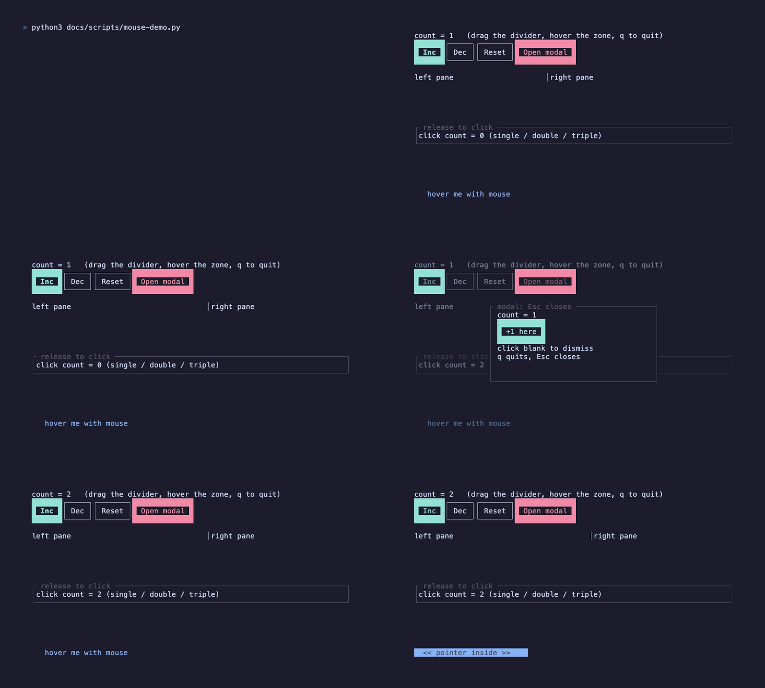
The callback receives () and follows the existing Handler<'static, ()> contract: captures must be Send + Sync + 'static. A State handle fits this pattern.
| Prop | Type | Default / behavior |
|---|---|---|
label | String | Empty label |
on_press | Handler<'static, ()> | No-op; left Down triggers once, Up does not repeat |
variant | ButtonVariant | Primary; also Secondary, Danger |
disabled | bool | false; disables callback and visible hover, passes input through |
width | Option<u16> | Display width of label + 4 cells, including border |
style | Option<Style> | Patches variant style; disabled styling takes precedence |
Height is fixed at three rows. width is a cell count, not a Constraint; put the button inside a View to position it. Disabled buttons remain in layout and keep hook order stable; they do not intercept clicks on underlying content.
ButtonTheme derives from the nearest Palette, with primary_style, secondary_style, danger_style, disabled_style, and hover_modifier slots. Override the component theme through ThemeOverride::<ButtonTheme> or patch a single button with style. Hover adds the theme modifier (bold by default). Enabled buttons use the resolved background color for their border and label rather than painting a solid rectangular fill.
Interaction boundary
Section titled “Interaction boundary”Button does not provide keyboard focus or Enter/Space activation. Register application keyboard shortcuts separately and call the same business action. For release-to-activate or double-click behavior, compose use_click on your own component. For a disabled button inside a modal, a click may continue to the modal’s scrim handler and dismiss it; configure the panel handler if that is not desired.
See Pointer Events for propagation, capture, dragging, and the runnable modal composition.