
ShortcutInfoModal
ShortcutInfoModal is the shortcut help modal. It is useful for showing page, modal, or workspace shortcuts grouped into sections, and it hands overflow content to an internal ScrollView when the content is taller than the modal.
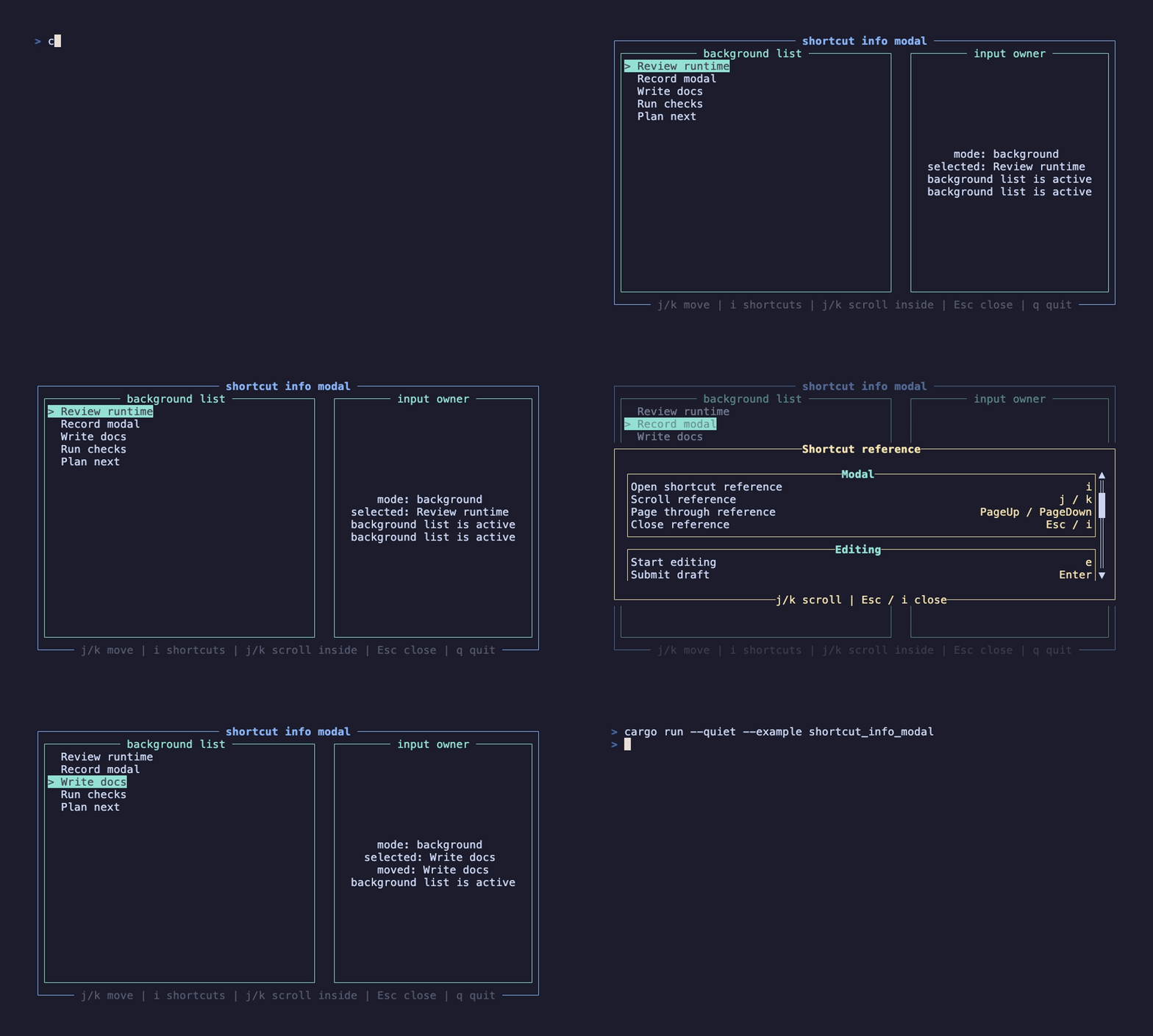
This recording is generated by docs/tapes/shortcut-info-modal.tape. The example first moves the background task list, then opens the shortcut manual. Pressing j several times inside the modal scrolls the manual, but the background selection does not move further. After closing, pressing j again makes the background list respond.
In the background state, press j/k to move and i to open shortcut help. Inside the modal, press j/k to scroll help content, Esc or i to close, and q to quit.
Minimal form
Section titled “Minimal form”ShortcutInfoSection::new accepts any entries that can convert into ShortcutInfo. The most common form is (&str, &str): the left side is the action description, and the right side is the shortcut combination.
Input exclusivity and scrolling
Section titled “Input exclusivity and scrolling”Like the other built-in modals, this component creates an exclusive input layer internally and passes that same layer to the low-level Modal:
The key difference is the final EventResult::Ignored. Close keys are consumed by the modal; other keys continue to the ScrollView on the same layer, so j/k, arrow keys, and page keys can still scroll the help content. Because this layer has blocks_lower=true, even if ScrollView also returns Ignored, the background layer still does not receive the same keys.
Close keys
Section titled “Close keys”The default close keys are Esc, i, and I:
If your page already uses i for another foreground action, replace close_keys. The bottom hint is controlled by close_hint and is not generated from close_keys.
Size and style
Section titled “Size and style”ShortcutInfoModal exposes the low-level Modal size, mask, and main text styles:
The content area already wraps a ScrollView. If you need search, filtering, or dynamically generated help items, just regenerate sections. If the modal also needs an input box, list selection, or multi-step interaction, compose the low-level Modal + use_input_layer instead.
For ordinary messages, see AlertModal. When the user needs to choose, use ConfirmModal.