Native Widget Bridging
custom_widget replaces the old list / custom_list examples. Instead of only showing Item 1, it uses a deploy queue to explain when to keep using built-in components and when to drop down to a native ratatui widget.
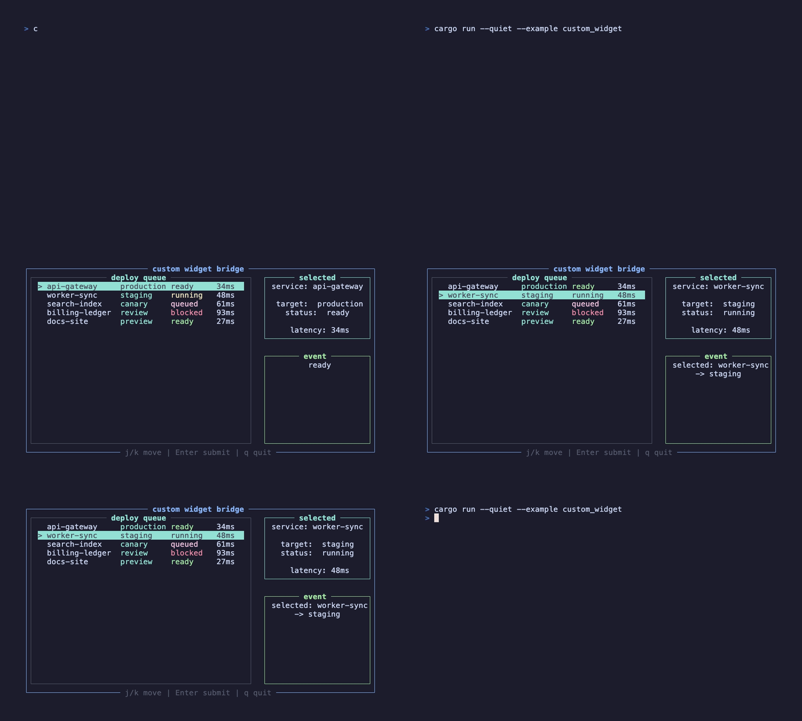
This recording is generated by docs/tapes/custom-widget.tape and runs examples/advanced/custom_widget.rs. Press j/k to move through the queue and Enter to submit the current item; the right panel updates with ListState.
Why this layer exists
Section titled “Why this layer exists”Built-in Select, MultiSelect, TreeSelect, and VirtualList cover common selection scenarios. But the framework should not wrap every ratatui widget as a business component. For lower-level tables, charts, log panels, or custom painters, handwrite a Component and call ComponentDrawer directly during draw.
The outer layer is still a function component
Section titled “The outer layer is still a function component”The outer CustomWidgetApp is still an ordinary #[component]. Keyboard events, exit, and state reads live there:
ListState lives in use_state, so writes wake the render loop. State<ListState> is a lightweight handle that can be passed by value to handwritten components and event closures. DeployQueue(..queue_props) is used because props contain a required explicit State<ListState> and do not go through default props construction.
Handwritten Component
Section titled “Handwritten Component”The handwritten component has a narrow job: store the State<ListState> from props, synchronize the handle every frame in update, and render the native widget during draw.
write_no_update() is important: the draw stage is only rendering ratatui’s stateful widget into the buffer and should not trigger another reactive change. The actual selected item changes in the event handler through state.write().select(...).
Low-level update boundaries
Section titled “Low-level update boundaries”A handwritten Component is closer to the runtime than a function component, so it can access ComponentUpdater and ComponentDrawer. These are not everyday business APIs, but they matter when you write a truly low-level component:
| Capability | Stage | Usage |
|---|---|---|
| Sync props into instance fields | update | Copy handles or config such as props.state and props.items into the component instance |
| Use hooks | update | Plain use_state can be used directly; hooks that need context, such as use_event_handler or use_context, need hooks.with_context_stack(...) first |
| Set layout fields | update | When props use #[with_layout_style], call updater.set_layout_style(props.layout_style()) |
| Make a component transparent for layout | update | Call updater.set_transparent_layout(true), usually done automatically by the #[component] macro |
| Manually update children | update | Call updater.update_children(elements, context), useful for components that organize their own subtree |
| Draw ratatui widgets | draw | Use drawer.render_widget or drawer.render_stateful_widget |
| Customize child regions | calc_children_areas | The default is flex layout; complex containers can override it, but the returned region count must equal the child count |
The hooks value passed to a handwritten component is not context-aware by default. To register events or read Providers, upgrade it first:
This step is needed only in handwritten Components. The #[component] macro handles it for function components, where you can normally call use_event_handler, use_exit, and use_context directly.
If you only need to read or modify context data, you can also go through ComponentUpdater directly:
That API is lower-level and better suited to framework components. Business components should prefer hooks with semantic names, such as use_exit() instead of directly mutating SystemContext.
Adapter or handwritten component
Section titled “Adapter or handwritten component”If you only need to place an existing widget in the element tree, use the adapter syntax in the macro:
If you need to construct a complex widget inside a component, split props, reuse drawing state, or plug into custom layout, handwrite Component. This boundary is clearer than wrapping everything as built-in components, and it keeps business components from polluting the framework API.
Next, see Custom Hook: stable state, side-effect, and subscription patterns can become your own business use_* functions.