
Table
Table is a generic, data-driven table component available with the table feature. You describe the columns and give it a list of rows plus a render_row closure; the component owns width resolution, CJK/emoji-aware cell wrapping, cell-grid borders, selection, a footer row, and layout height. It stays business-neutral: the row type T is yours, and the component never assumes what a row means.
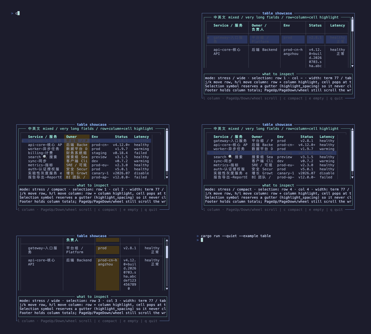
This recording is generated by docs/tapes/table.tape. It selects a row by default (the ▶ gutter and row highlight), moves the column highlight with l/h, switches density with c, reveals the footer totals with PageDown, and toggles the empty state with e.
Press j/k to move the selected row, h/l to move the selected column, PageUp/PageDown or the mouse wheel to scroll, c to toggle compact density, e to toggle the empty state, and q to quit.
Feature
Section titled “Feature”Table is behind the table feature:
Examples use the full feature, so they can be run directly. The library has an intentionally empty default feature set; a bare cargo check will not compile the table component.
Why not the native ratatui Table?
Section titled “Why not the native ratatui Table?”Table is a from-scratch renderer, not a wrapper around ratatui::widgets::Table. It exists to do three things the native widget cannot:
- Cell grid lines —
TableBorderMode::Griddraws box-drawing borders between every cell and row (native tables only have an outerBlock). This is what makes it suitable for markdown-style tables. - Automatic cell wrapping — long cell text wraps to fit the column width with correct CJK/emoji visual widths (native tables truncate, or require you to pre-wrap and set a row height).
- Responsive columns — a column can disappear below a width threshold with
min_table_width.
If you want the native windowed-scrolling table instead (only visible rows rendered, 2D cell selection, a footer), it is already reachable through the stateful(...) adapter, since ratatui::widgets::Table is a StatefulWidget. Reach for Table when you want borders, wrapping, and framework-integrated selection.
Columns
Section titled “Columns”A column is a header, a width Constraint, an alignment, and an optional responsive threshold:
Widths accept Length / Min / Max / Percentage / Ratio / Fill; the component resolves them against the available width (after borders, padding, and the selection gutter) and scales down proportionally on overflow. min_table_width(n) hides the column entirely while the table is narrower than n, which keeps a wide table readable when the terminal shrinks.
Rows and render_row
Section titled “Rows and render_row”Rows are your own data. render_row turns one row (and whether it is selected) into a Vec<TableCell>, one cell per column:
A TableCell is a Line plus an optional per-cell style and alignment (the alignment falls back to the column’s). Cells beyond the column count are ignored; missing cells render empty.
Borders, wrapping, and separators
Section titled “Borders, wrapping, and separators”Griddraws a full cell grid;Outerdraws only the outer box;Nonedraws no borders and usescolumn_spacingbetween columns.Wrapbreaks long lines at whitespace (falling back to a hard break), measuring CJK/emoji as width 2;Truncateclips to one line.- Row separators and the header separator only take a visible line in
Gridmode.
Footer
Section titled “Footer”Pass a footer row of cells (one per column) for totals or a summary line. It is aligned to the same columns and drawn after the body, with an optional separator:
Selection, highlight, and the gutter
Section titled “Selection, highlight, and the gutter”Table tracks a selected row (and optionally a selected column) in TableState.
highlight_spacingdecides whether the selection symbol reserves a leading gutter. With the defaultWhenSelected, the gutter appears while a row is selected, so the▶symbol never overwrites the first column’s content (the nativeHighlightSpacingbehavior).Alwaysreserves it unconditionally;Nevernever draws the symbol.column_highlight_styletints the whole selected column (header, body, and footer);cell_highlight_stylepatches on top at the row/column intersection. Both are empty by default, so they only show once a column is selected.- Built-in keys (when
active):j/k/Down/Upmove the row,Home/Endjump,Enterfireson_select. Settingcolumn_navigation: trueaddsh/l/Left/Rightto move the selected column.
External state
Section titled “External state”By default Table owns its TableState. Pass external state when the page needs to read the current selection, drive it from its own keys, or keep it stable across re-mounts. The example drives selection from the page so the surrounding ScrollView keeps owning PageUp/PageDown and the wheel:
TableState exposes selected() / select() / next() / previous() / select_first() / select_last() for rows, and selected_column() / select_column() / next_column() / previous_column() for columns. The selected column is an index into the full column list, so it stays stable even when responsive hiding changes which columns are visible.
Layout and height
Section titled “Layout and height”Table accepts width, height, margin, and offset. When height is left at the default, it estimates the rendered height (including wrapping, grid lines, and the footer) so the table takes exactly the space it needs. For a table taller than its viewport, wrap it in a ScrollView — the example does this and lets the ScrollView clip the overflow while PageUp/PageDown scroll it. For plain long lists prefer VirtualList; for ordinary single/multi select see Select and MultiSelect.