
跳转到内容

ConfirmModal 确认弹窗

ConfirmModal 是普通确认弹窗组件。它内部创建独占 input layer,并把同一个 layer 传给底层 Modal,因此弹窗打开时背景列表、页面快捷键和其它下层 handler 都不会处理同一组按键。
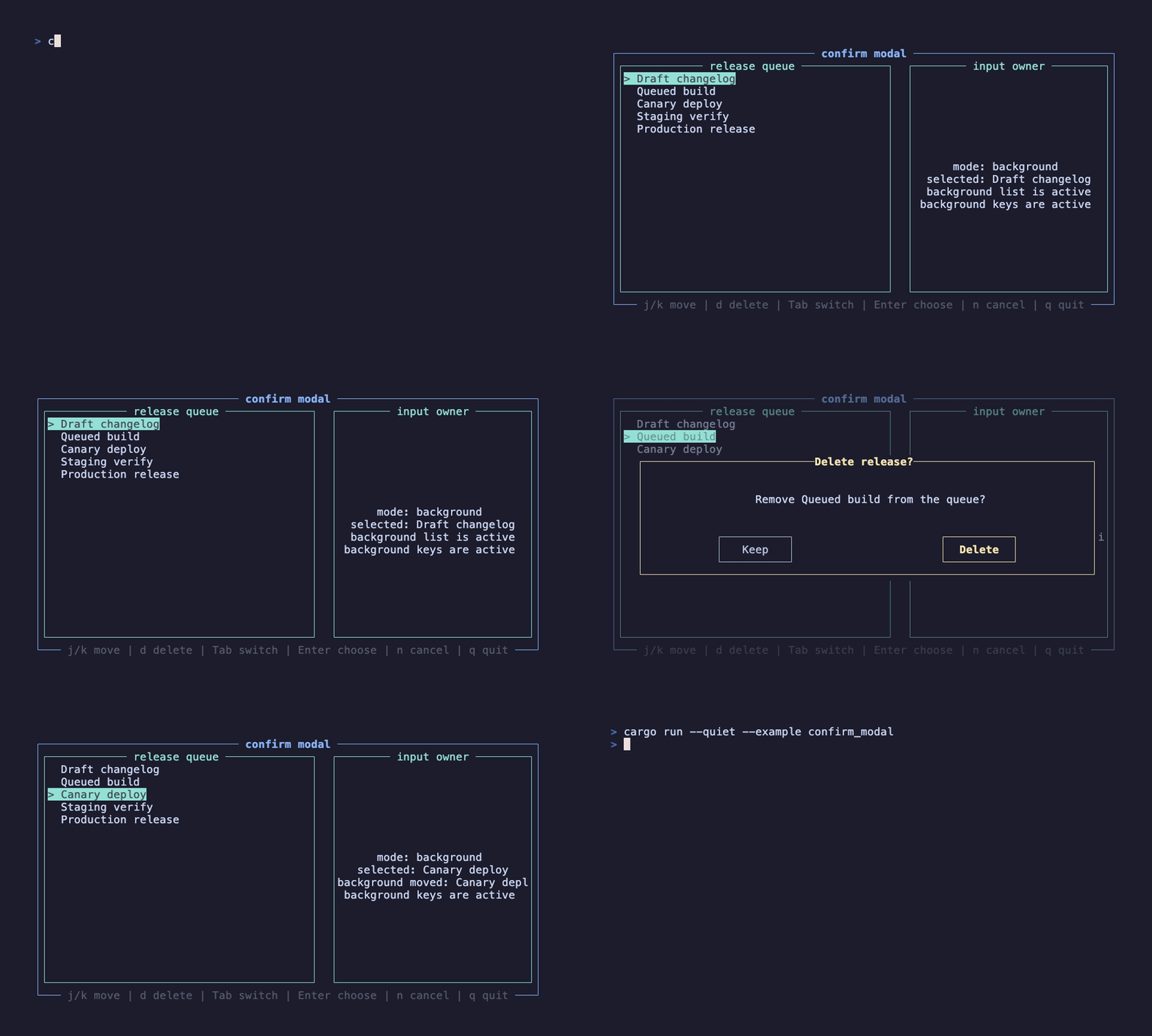
confirm modal demo

这个录屏由 docs/tapes/confirm-modal.tape 生成。示例先把背景列表移动到 Queued build,再打开删除确认;弹窗打开后按一次 j,背景选中项没有继续下移。随后用 Tab 切到 Delete 并按 Enter,再演示一次 n 取消。

cargo run --example confirm_modal

背景状态下按 j/k 移动,按 d 打开弹窗,弹窗内按 Tab、方向键或 BackTab 切换按钮,按 Enter 触发当前按钮,按 y 直接确认,按 nEsc 取消。

ConfirmModal(
    open: confirm_open.get(),
    title: Line::from("Delete release?"),
    content: format!("Remove {selected_label} from the queue?"),
    confirm_text: "Delete".to_string(),
    cancel_text: "Keep".to_string(),
    on_confirm: move |_: ()| {
        status.set(format!("deleted {selected_label}"));
        confirm_open.set(false);
    },
    on_cancel: move |_: ()| {
        status.set("kept release".to_string());
        confirm_open.set(false);
    },
)

ConfirmModal 是受控弹窗:open 决定是否显示,组件不会自己修改外部状态。on_confirmon_cancel 只表达用户意图,是否关闭弹窗由业务在回调里决定。这个设计让你可以在确认后先做同步校验、异步提交或二次状态更新。

组件内部等价于下面这组配对:

let layer = hooks.use_input_layer(open, true);

hooks.use_event_handler(EventScope::Layer(layer), EventPriority::High, move |event| {
    // handle Tab / Enter / y / n / Esc
    EventResult::Consumed
});

Modal(open: open, layer: Some(layer)) {
    // dialog content
}

这正是 输入层 里推荐的写法。普通确认弹窗不需要业务手写 use_input_layer;只要把 open、文案和回调交给 ConfirmModal,它会保证前景弹窗拥有键盘。

未知按键也会被弹窗层消费。示例里弹窗打开后按 j,背景队列没有移动,就是因为 ConfirmModal 的层设置了 blocks_lower=true

默认焦点在取消按钮上,这是确认弹窗的安全默认值。用户可以通过这些键改变或触发按钮:

行为
Tab / BackTab在取消和确认之间切换
Left / Right在取消和确认之间切换
Enter触发当前焦点按钮
y / Y直接确认
n / N / Esc直接取消

button_style 用于未选中按钮。selected_button_style 用于选中按钮的焦点色:边框和文字会一起高亮,但不会把整个按钮内部铺成色块;如果样式带背景色,组件会把背景色转换为焦点 accent 色:

ConfirmModal(
    button_style: Style::new().gray(),
    selected_button_style: Style::new().yellow().bold(),
)

ConfirmModal 直接暴露底层 Modalwidthheight 和遮罩 style,并暴露内容区样式:

ConfirmModal(
    width: Constraint::Length(70),
    height: Constraint::Length(10),
    style: Style::new().dim(),
    border_style: Style::new().yellow(),
    title_style: Style::new().yellow().bold(),
    content_style: Style::new(),
)

如果弹窗里需要列表、输入框、滚动区域或复杂快捷键,再使用底层 Modal + use_input_layer 组合。提示型弹窗看后续 AlertModal,快捷键帮助看后续 ShortcutInfoModal